Mirror
views
Minimalist Living
views
  • What is Mirror

    Mirror is a clothing store. They supply good quality products with affordable prices for adults. They have adopted a minimalistic approach for their product but they currently have an out-of-date informational webpage that solely contains outdated information.

  • Objective

    Our goal is to update its outdated logo to increase its appeal to consumers and to create a responsive online store to boost sales.

  • Project Scope

    Create a responsive ecommerce website for a brand

    Tools

    Figma

  • Role

    UX Designer (Research, UI design,Visual Design, ,User Testing)

  • Duration

    Total of 8 weeks

    Team

    Self Directed, with feedback from the mentors

  • Research

    Research Plan

    Problem
    • Mirror does not have a responsive website and is losing opportunities for online sales efforts. Mirror is losing revenue and competition when customers cannot find the sizes that they want.
    Methodologies
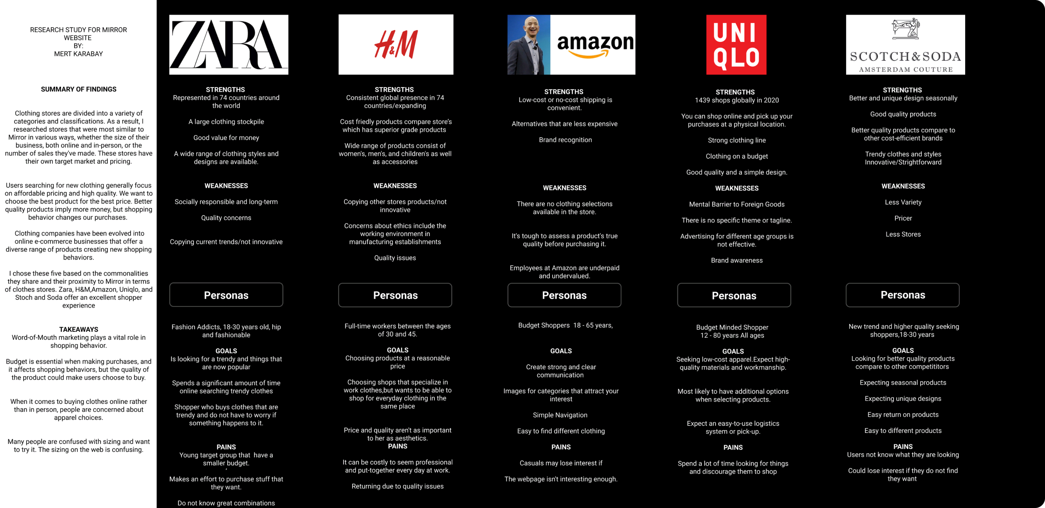
    • Comparative and competitive research to see our competitor’s business efforts and their pain points.
    • User Interviews to learn what people from different demographics and backgrounds think about the product/service and their motivations
    Participants
    • Men and women 18-30
    • People who shop online
    • People who prefer buying in-store rather than online
    • People who have not interacted with the brand.
    Research Goal
    • We want to know what motivates (and frustrates) a customer while navigating a shopping website. We are trying to create a simple and enjoyable online shopping experience for the customer so that it can help the business generate online revenue
  • Competive Analysis

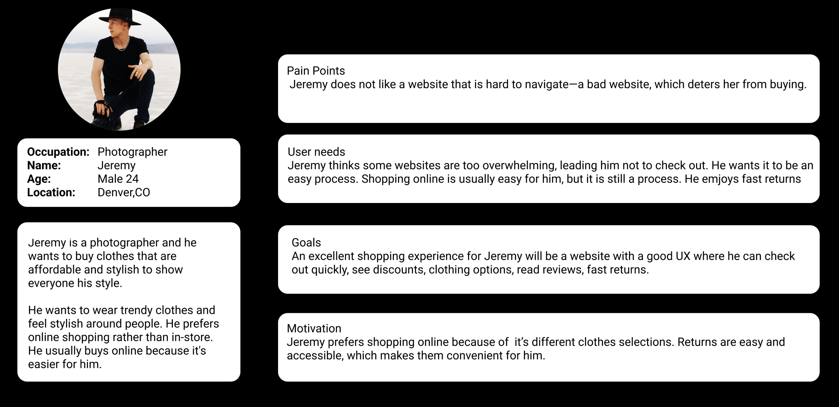
  • Persona

    The company is looking for young professionals 21-30 age group with an eye for fashion, who want the best of both worlds - high-quality products that don't break your bank account.
  • User Interviews

    Goals
    • Simple and easy process of checking out
    • Content that is not misleading
    • Easy return policies
    Needs
    • Organized web design
    • Customer reviews
    • Great return policy
    Motivations
    • Participants know where to shop, and they do not need to go to the store. They believe in the quality of the products and the brand.
    • People who shop online.
    • People who prefer buying in-store rather than online.
    • People who have not interacted with the brand.
    Frustrations
    • Participants are scared about getting a low-quality product than they expect.
    • A website that has bad UX discourages them from shopping.
    • Disorganized onlines stores make them not want to shop.
    • Unreliable return-policies.
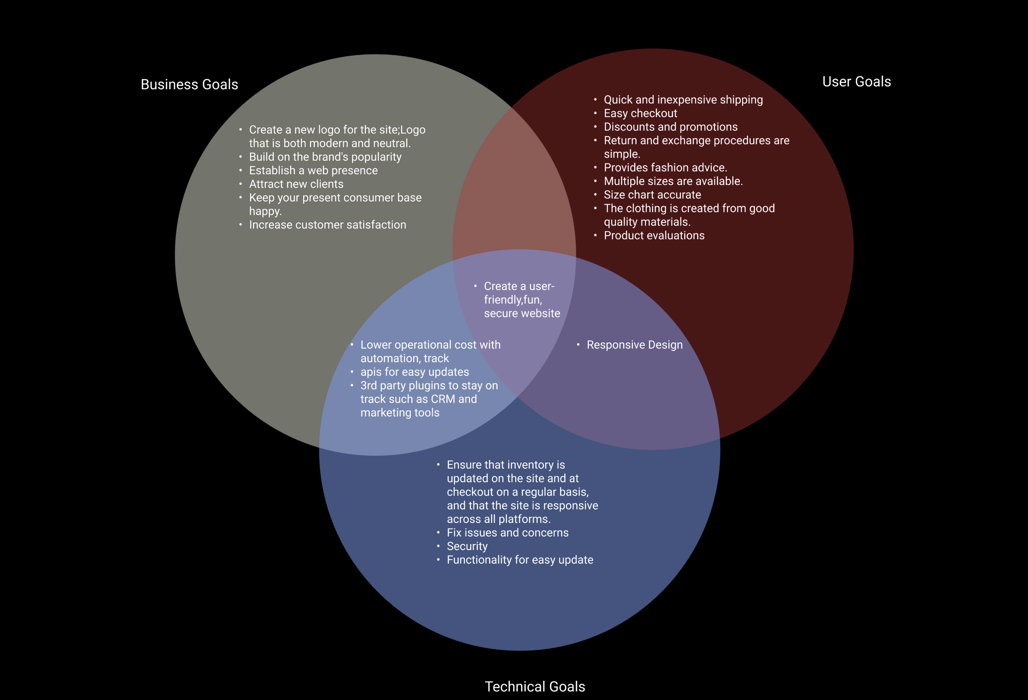
  • Project Goals

  • Information Architecture

    Feature Roadmap

    What are the best tools for this particular project? That's a question we can answer with our research. We have conducted research and created personas to help guide what type of tools might be most appropriate for users.

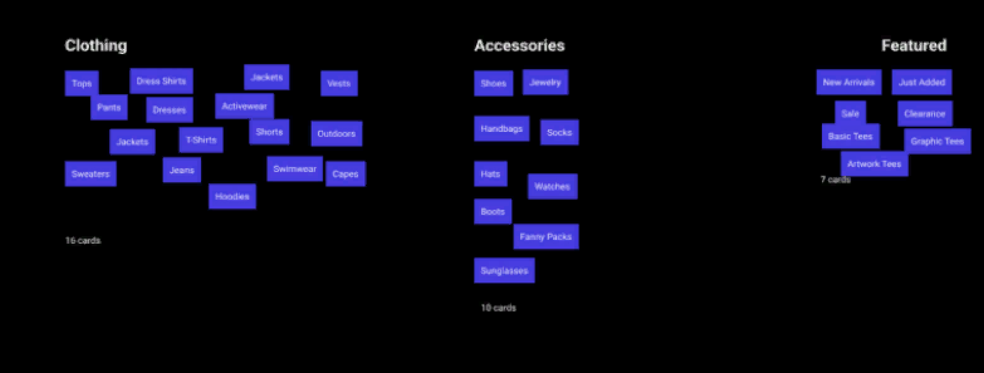
  • Card Sorting

    Created a Figma file that had 33 of the depicted cards. Participants created categories for them and were able to drag and drop the cards to the category they hought fits best.
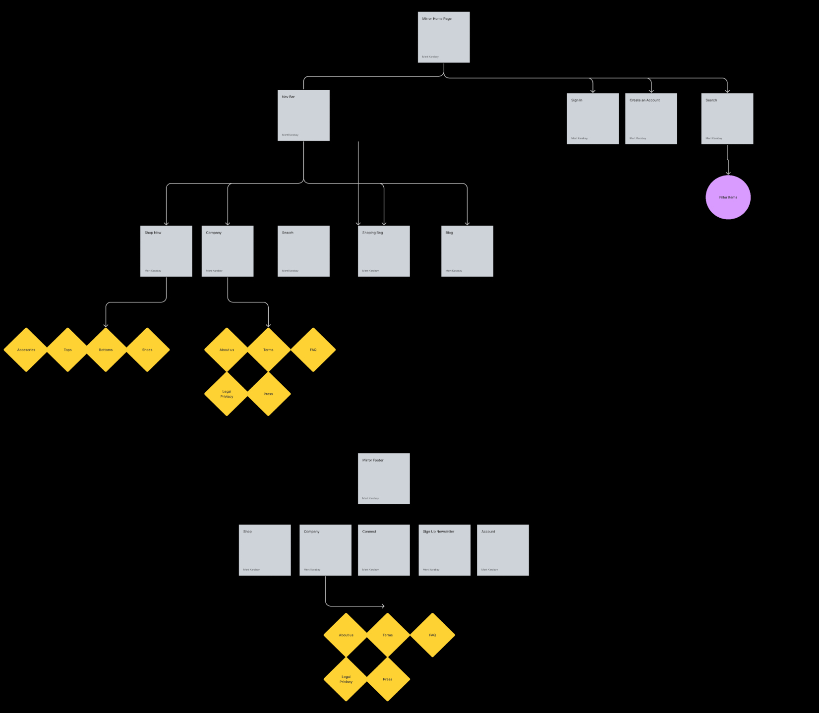
  • Sitemap

    I organize and display the website's information so that everything can be easily found. It provides users with the most up-to-date available data on how I want them to navigate every page of their journey when using or to interact within this online space.
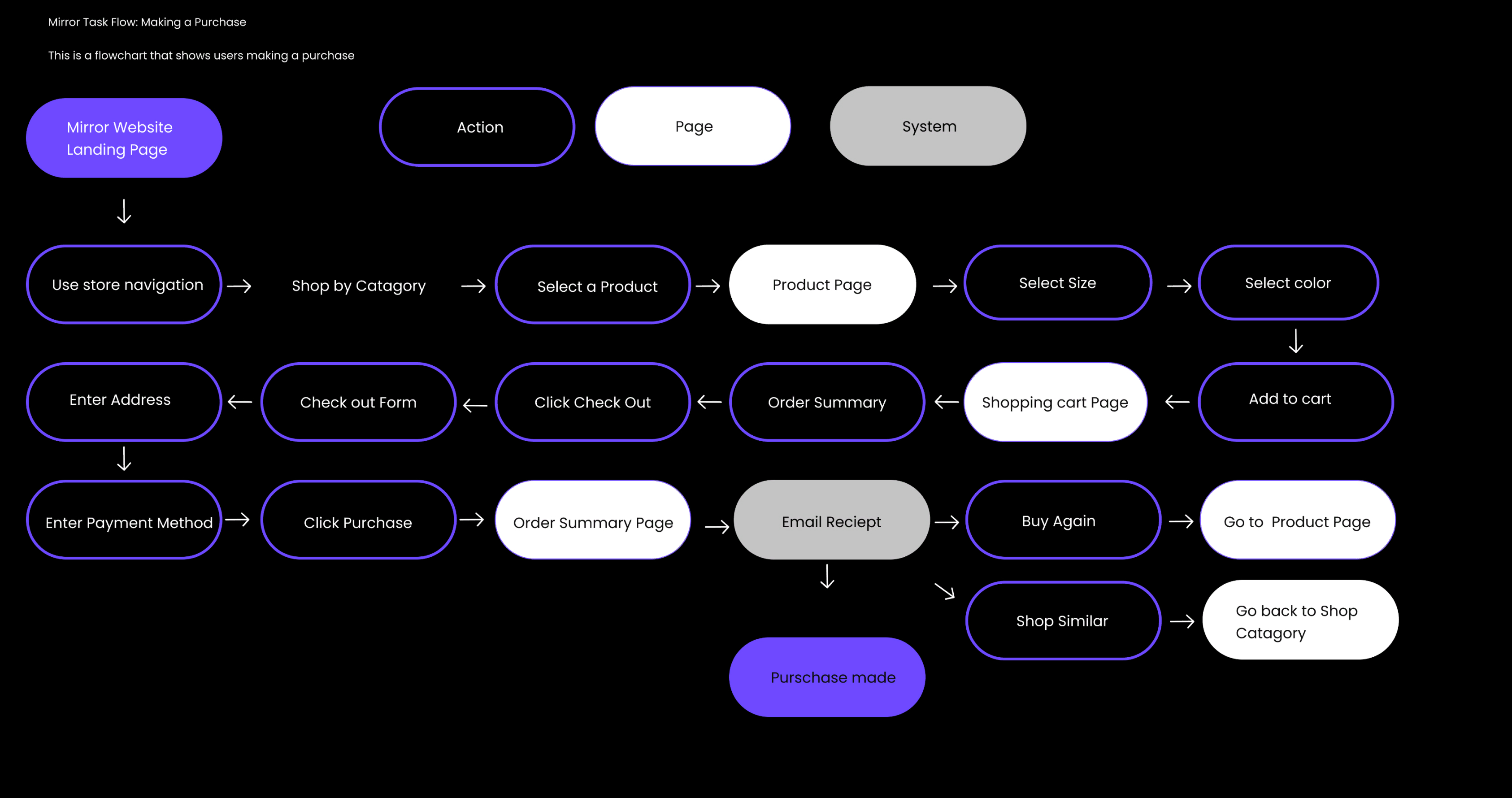
  • Interaction Design

    Task Flow

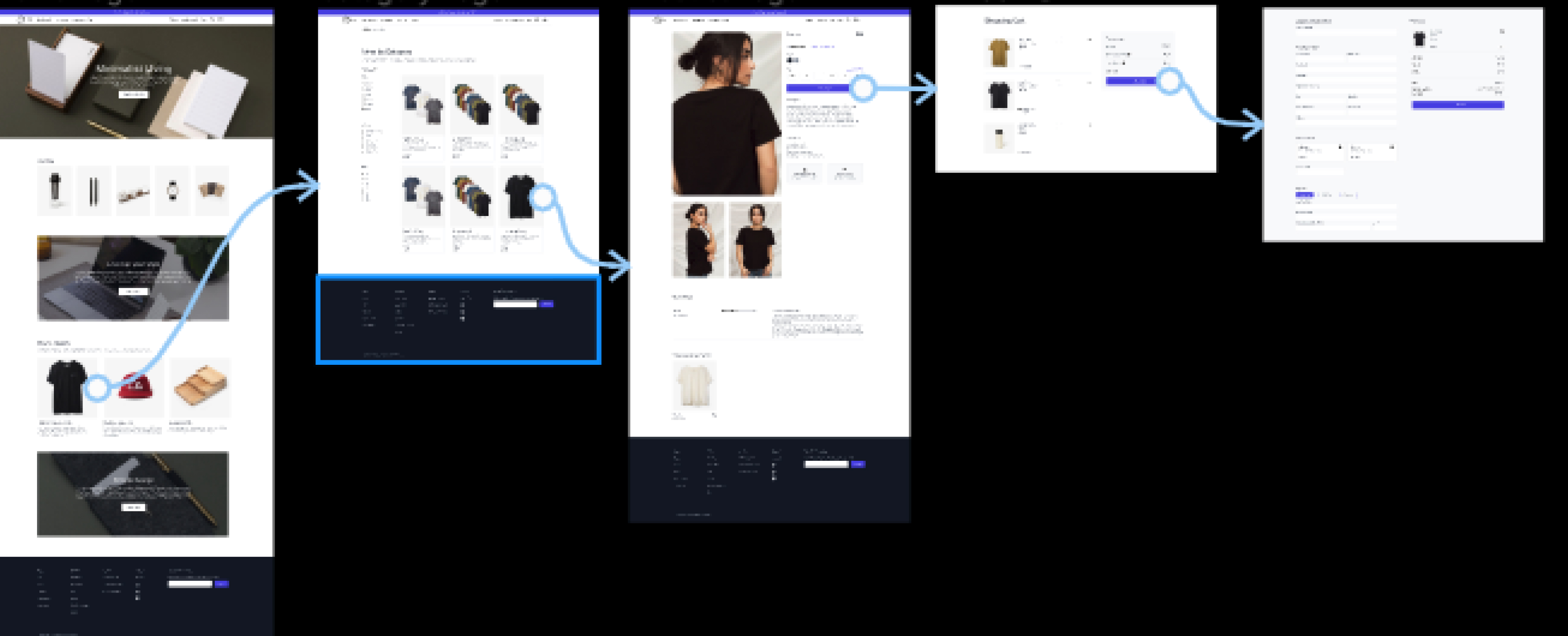
    The customer is searching for a new t-shirt to purchase. The user's search options allow them the ability of filtering results based on color or design this task flow illustrates how a user would search for and purchase a t-shirt.
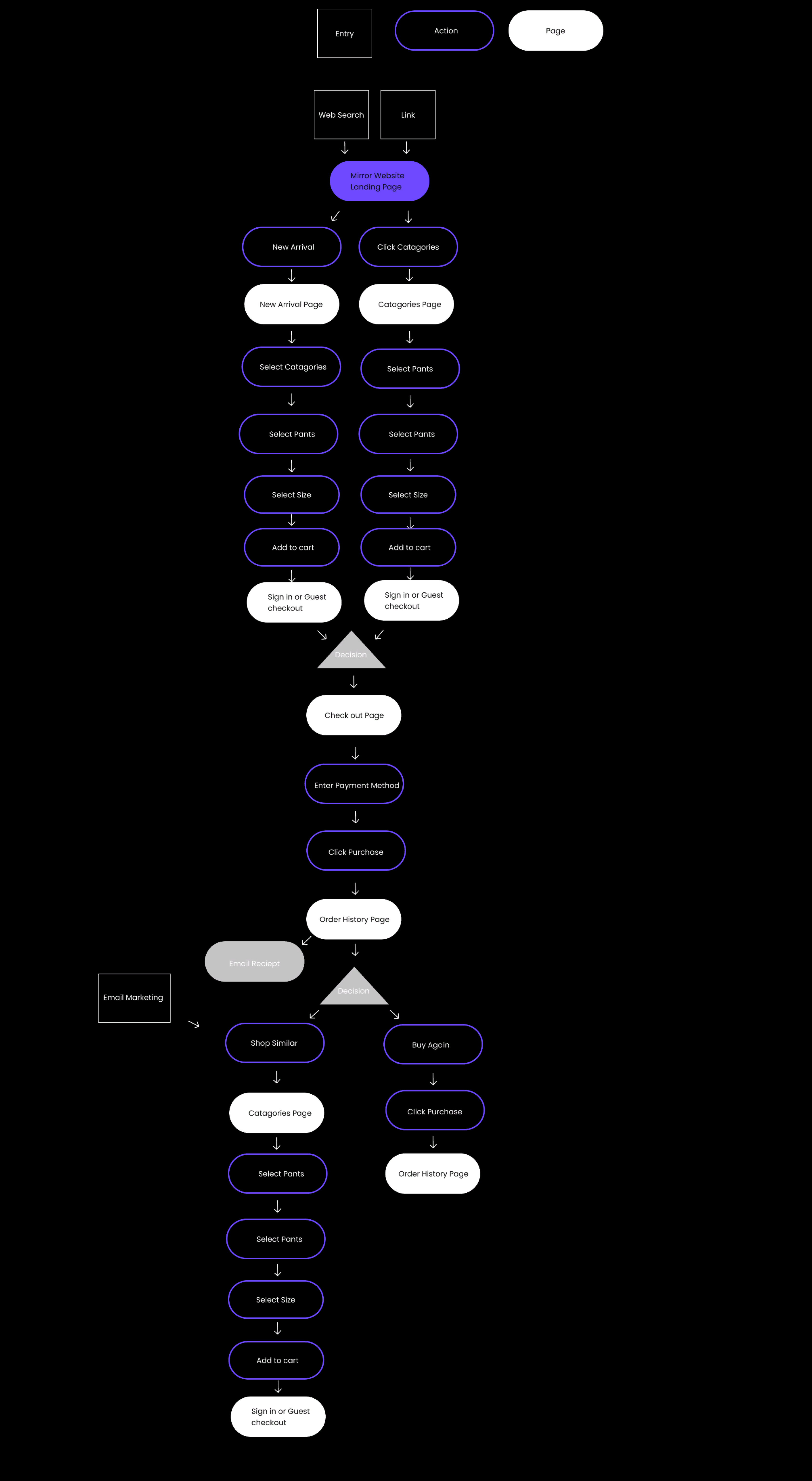
  • User Flow

    Searching for a product online can be overwhelming. With so many options, it's easy to get lost and end up not buying anything at all! That’s why this user flow depicts the different steps that you should take when searching to make your purchase as simple and stress-free as possible- after all, we want our customers to come back again.
  • Wireframes

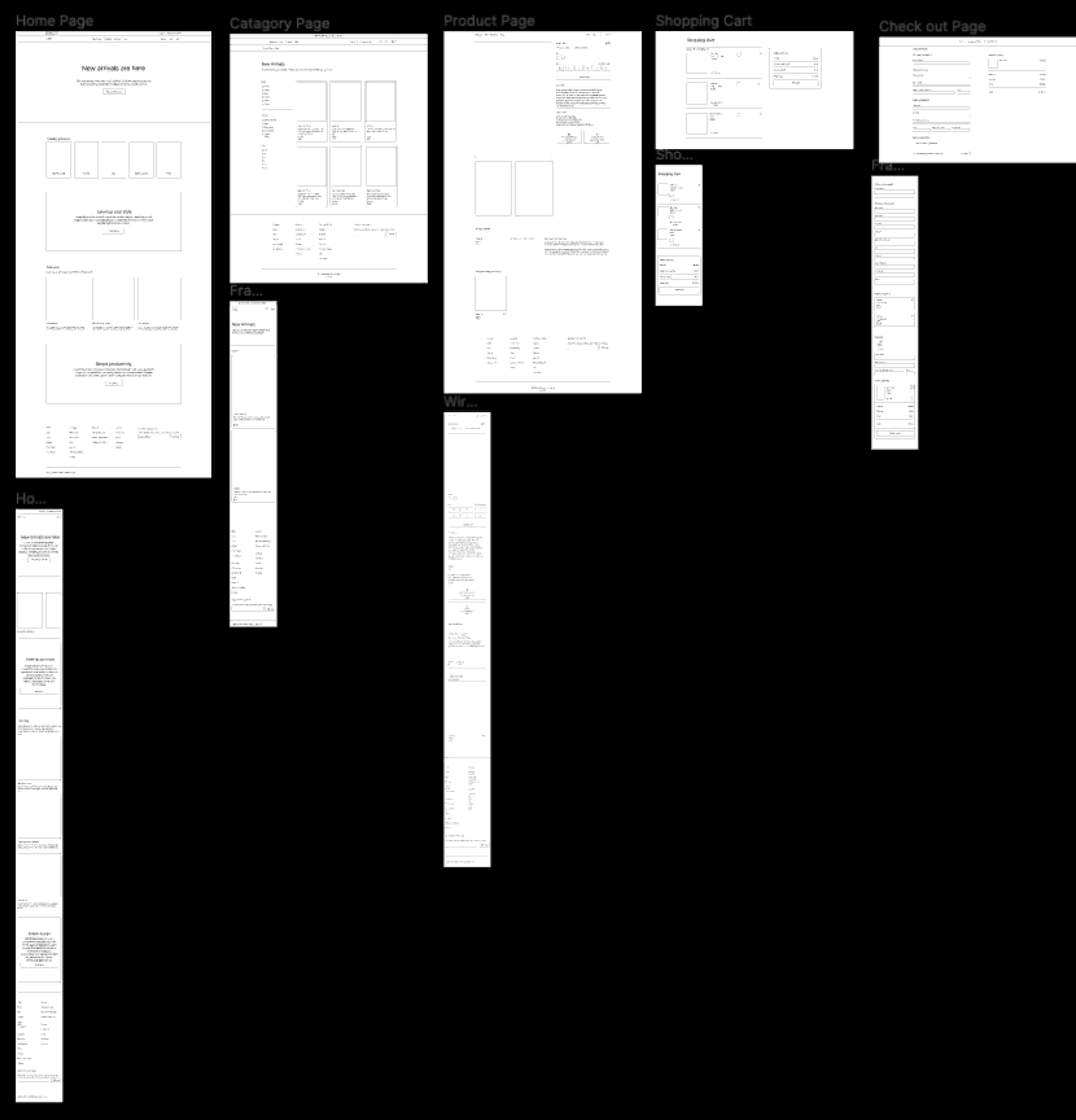
    Responsive low-fidelity wireframe for web,tablet and mobile versions for a user to make a purschase
  • UI Design

    Mood Board

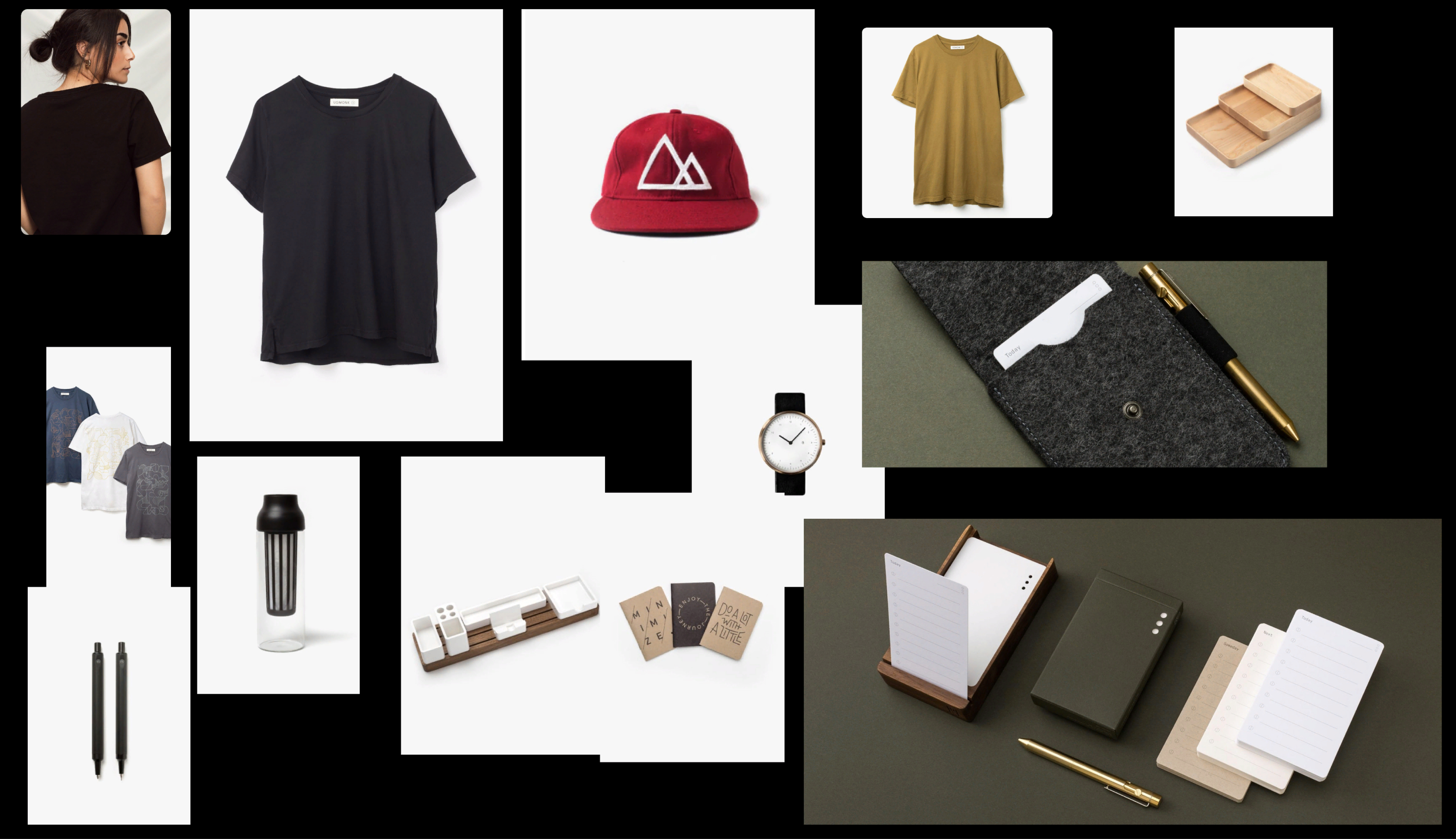
    With the help of my branding, I wanted to create a modern and casual look. Since it’s also minimalistic in nature with simple designs that are happy-themed towards being sophisticated while still maintaining an airy feel--the user interface kit included these elements too!
  • UI Kit

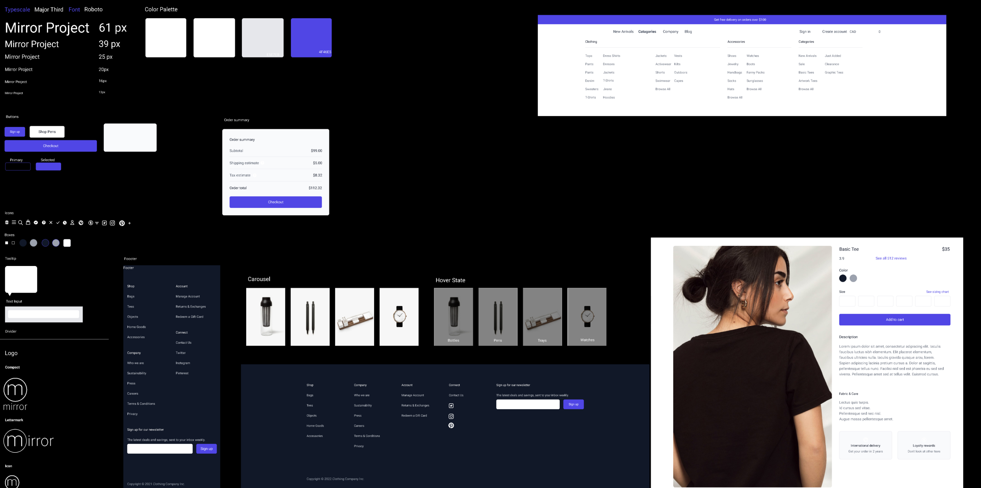
    With the help of mood boards and logos, our branding was modernized to give off that distinctive look. We also created a UI kit with fundamental components like fonts or icons, so it’s easy for us to implement into any site design.
  • Responsive Design

    VIEW DESIGN
  • Iteration & Implementation

    Prototype

    This task flow illustrates how a user would search for and purchase a t-shirt
  • Test Planning

    Objective
    • Examine the proposed Mirror page designs' overall usability. Is it easy to identify and understand the calls to action? Is it simple to find essential functions like sort, filter, favorites, and add to bag? Are the products prominently displayed to demonstrate color and size options?
    • See how quickly you can complete the purchase and if a user can fast go through the product choices, add it to your bag and check out.
    • Make a list of any pain spots. Were they expecting to see something else? Take suggestions
    Methodologies
    • Organized web design
    • Customer reviews
    • Great return policy
    Testing Subject
    • High-Fidelity prototype designs for Mirror's e-commerce website.
  • User Interviews

    Target Participants
    • Age through 21-30 years old
    • Background: Recent college graduates working full-time or preparing for master’s degrees have familiarity with online shopping.
    Participant 1
    • Age:22
    • Gender: Female
    • Familiarity level with online fashion shopping: High
    • Persona similarity: Yes
    Participant 2
    • Age:23
    • Gender: Male
    • Familiarity level with online fashion shopping: Medium
    • Persona similarity: Yes
    Participant 3
    • Age:24
    • Gender: Male
    • Familiarity level with online fashion shopping: High
    • Persona similarity: Yes
  • Test Findings

    Home Page
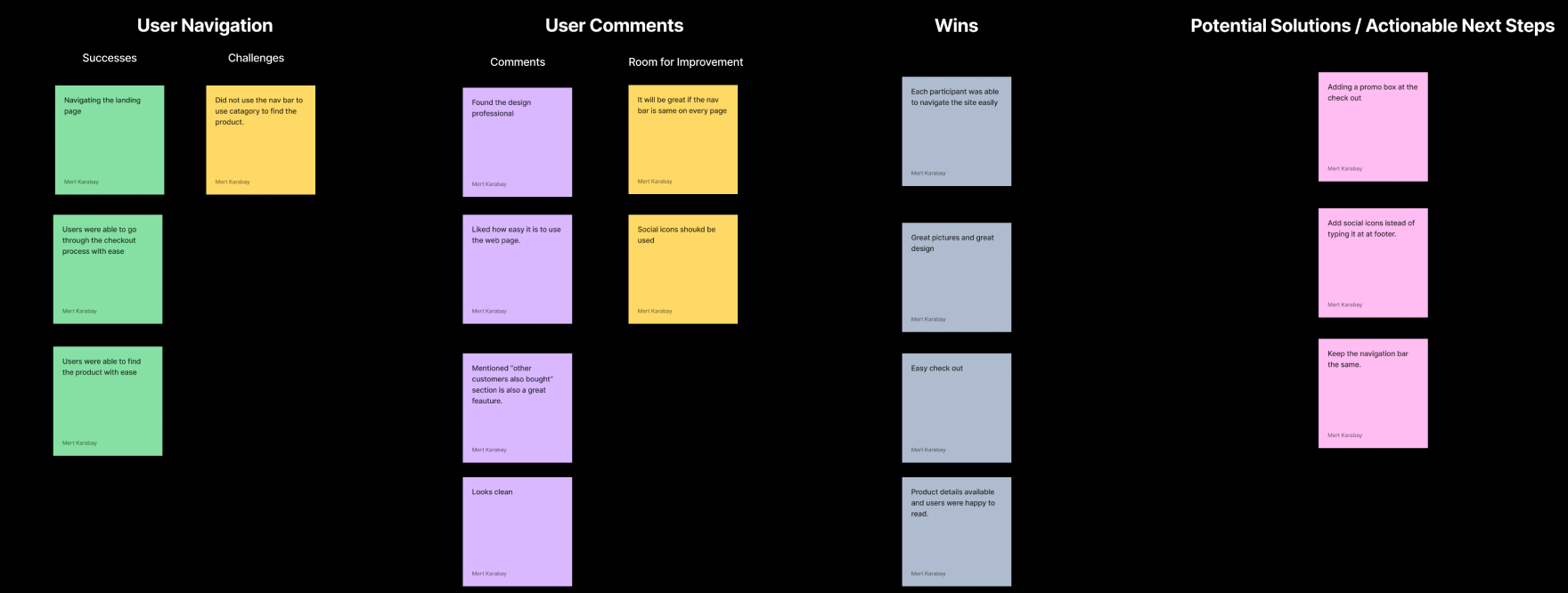
    • Participants used the homepage rather than the categories dropdown to find the products. They were happy to see trending products above the category’s carousel.
    • One participant wanted to see social icons instead of a typed version.
    • Participants used t-shirt photo under categories to find the product.
    Product Page
    • Participants liked the images on the page. They found it clear and attractive. They were happy to see the shipping and loyalty reward choices. They were glad to see the details about the product.
    • All participants chose the color first, then the size then added it to the shopping card
    Filter on Category
    • Participants found the filter option very easy to use. They were happy to see that price filter at the top. They were using the pricing filter first, then color and size.
    Shopping Card
    • All participants found it very easy to use and had no issues.
    Checkout
    • All participants found the checkout process to be straightforward. One participant wanted to see a promotion box before they checkout.
  • Affinity Map

  • Final Thoughts&Next Steps

Final Thoughts

With the completion of my final prototype, I feel that all objectives set out at the design start have been achieved. Mirror's new website is now responsive and easy for consumers to purchase clothing with- just like they want! I created an innovative product page interface that allows users a seamless shopping experience while browsing through different styles or looking up sizes; this will boost competition between retailers because there won't be any unnecessary clicks needed when searching through products on their site (no more waiting!).

Next Steps

I will code with HTML.CSS,Javascript and use Payment API to finish the project.